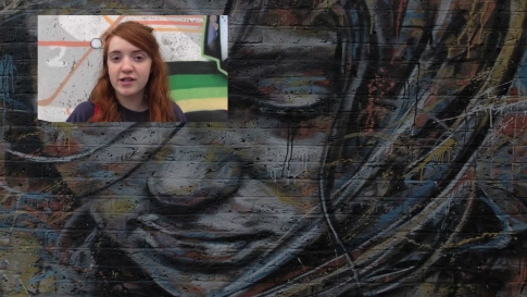
The website was created in a way that the user is confronted with Vicki’s piece-to-camera first, so that he is aware of what it is all about. It was also done this way to make sure that the user is definitely watching the PTC and not clicking on one of the ‘elite’ interviews in-between.
Then, for the purpose of user navigation, I arranged the videos into two home pages.
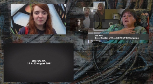
The first home page is playing animations, while the user is watching the ‘elite’ interviews. Corresponding with this is that I made the vox pops in favour of graffiti appear, once the user clicks on the See No Evil Project’s video. The vox pops against graffiti, however, are showing up as soon as the user is listening to Liz Kew’s interview.Furthermore, there is also a difference in the animations on this page: namely, the animations for the pro-videos are entirely playful, whereas the ones for the contra-side are appearing rather serious. This is due to the tendency that older generations may even regard graffiti as a personal threat (as Liz Kew told us), whereas the youth rather tends to like it.

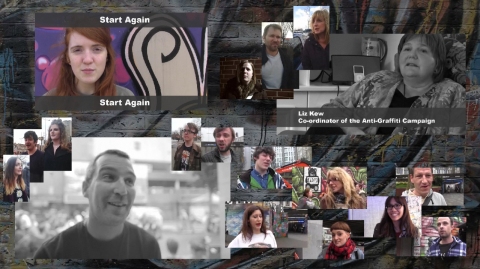
The second home page consists of a static page with all videos repeatedly playing on silent.
In between, the user can navigate through different interviews with members of the public (“vox pop”), that are visually explored by using graffiti images as a frame. This was done by cutting parts of the graffiti out onto a transparent background. I then overlaid the vox pops videos with these images, so that it appears that the vox pops are literally speaking their minds out of the graffiti.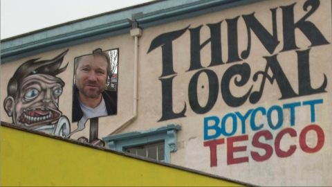
Originally, we intended to create a ‘home’ button on the scene containing the vox pop, which would then lead the user to the second home page. However, as I thought that it disturbed the idea of making maximum use of the visuals, I put an invisible button on the whole page instead.
The user can re-start the whole site by clicking on Vicki’s videos “Start Again” on the second home page (cf. fourth photo from above).
Last but not least, in general, the site is characterised by a rather “interfaceless” interface, as we abandoned the idea of visible buttons and a rather standard navigational menu bar.


