SUBMISSION

The link to our project is:

http://uwejournalism.net/streetart/

NOTE: Because the project is quite big and consisting of numerous high quality videos, longer loading times may occur.

This website was created to present the ongoing debate: is graffiti art or simply a form of vandalism?
However, in fact, the website is not even about the actuality of graffiti but rather about the perception of it within the public. Therefore, the project mainly consists of interviews with members of the general public, which were given a chance to speak out their opinions on Bristol graffiti. As it turned out that most of them were in favour of it, we additionally interviewed the co-ordinator of the anti-graffiti campaign alongside the Council, Liz Kew. She revealed some interesting background information.

Re-editing and saving vox pops videos and images

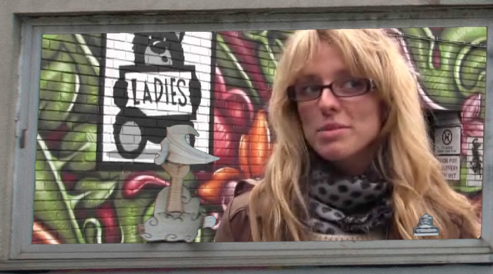
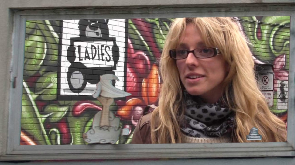
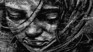
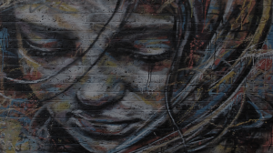
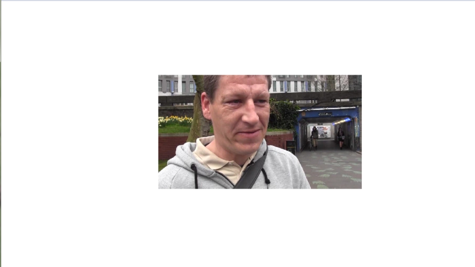
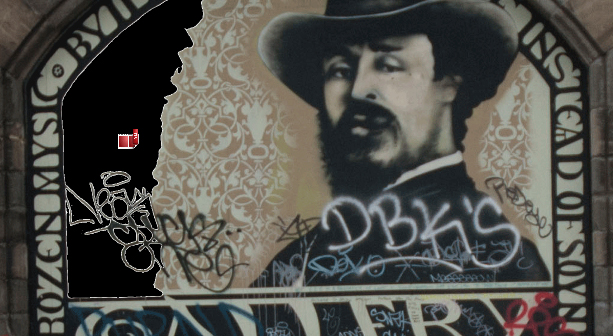
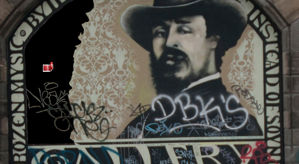
The images that were previously saved as PNG-8 images had a white border around the part that was cut out (cf. the first photo), when I put them into Flash. As Rod suggested in the workshop today, Vicki and I then re-saved them as PNG-24 images in order to solve the problem (cf. second photo).

image1
image2

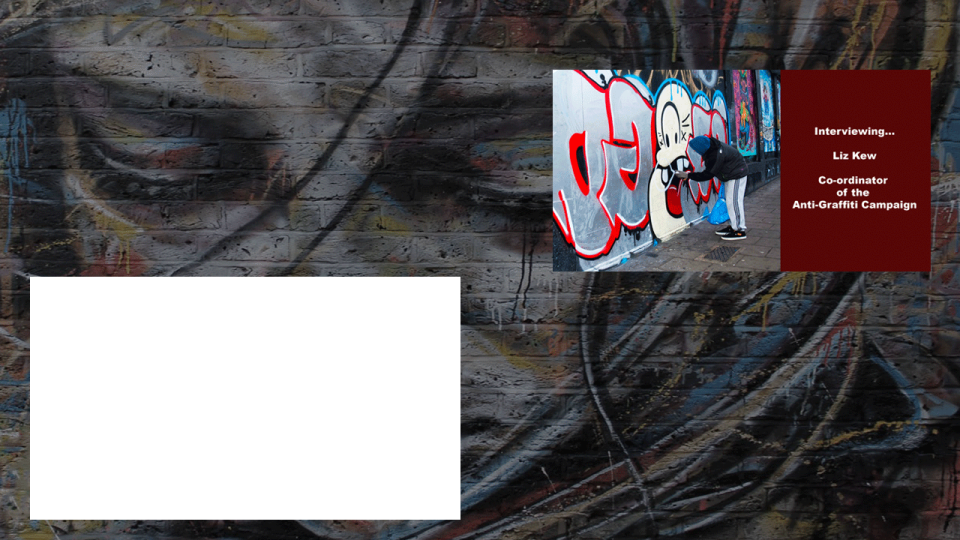
Furthermore, Vicki and I re-edited the vox pop videos in the workshop, so that we would keep the high quality of the original videos.

image3

photo7

Having created the website…

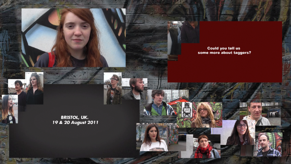
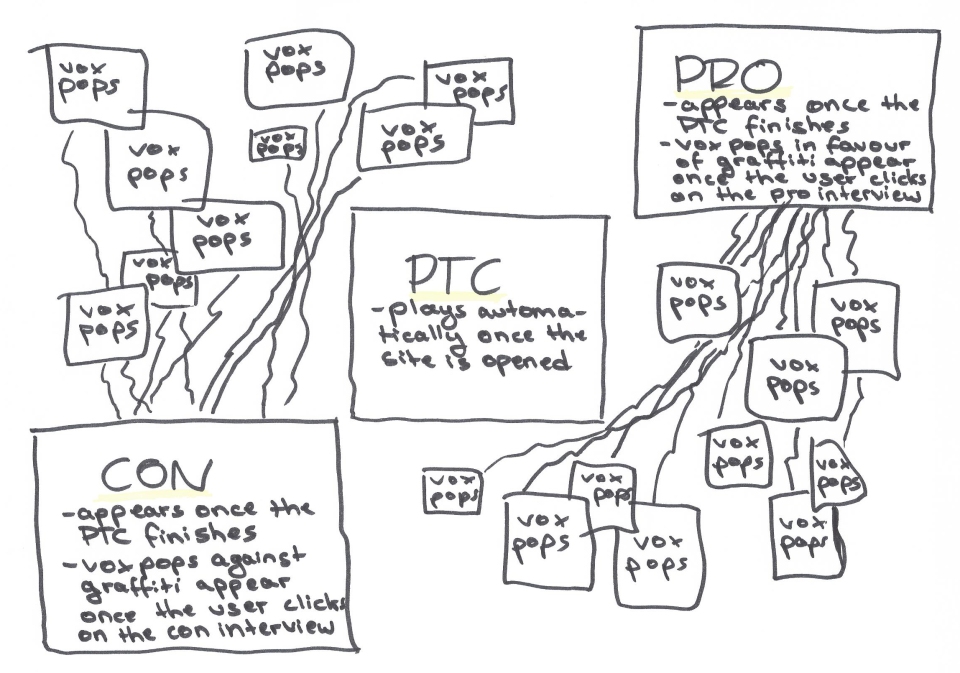
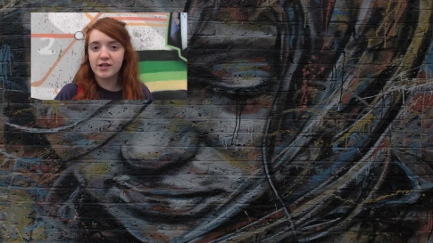
The website was created in a way that the user is confronted with Vicki’s piece-to-camera first, so that he is aware of what it is all about. It was also done this way to make sure that the user is definitely watching the PTC and not clicking on one of the ‘elite’ interviews in-between.
site1

Then, for the purpose of user navigation, I arranged the videos into two home pages.

The first home page is playing animations, while the user is watching the ‘elite’ interviews. Corresponding with this is that I made the vox pops in favour of graffiti appear, once the user clicks on the See No Evil Project’s video. The vox pops against graffiti, however, are showing up as soon as the user is listening to Liz Kew’s interview.Furthermore, there is also a difference in the animations on this page: namely, the animations for the pro-videos are entirely playful, whereas the ones for the contra-side are appearing rather serious. This is due to the tendency that older generations may even regard graffiti as a personal threat (as Liz Kew told us), whereas the youth rather tends to like it.

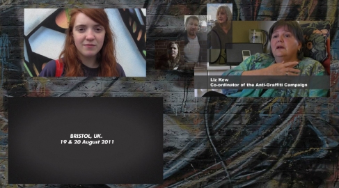
photo3

photo2

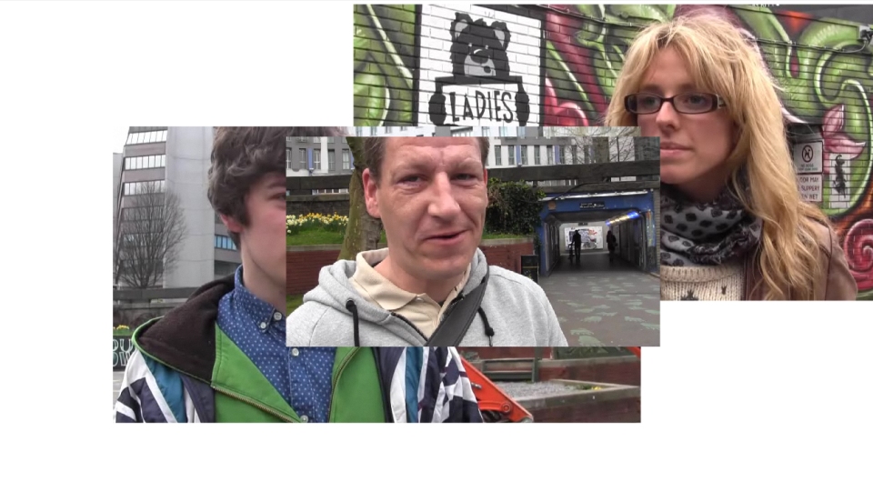
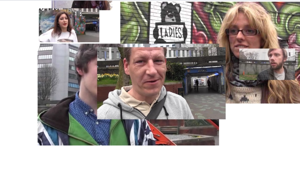
The second home page consists of a static page with all videos repeatedly playing on silent.
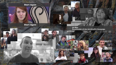
photo8

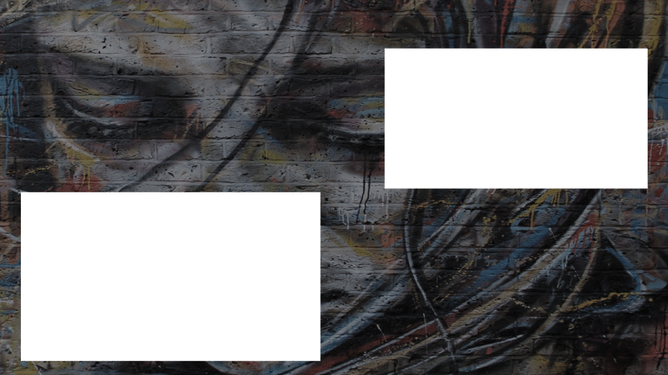
In between, the user can navigate through different interviews with members of the public (“vox pop”), that are visually explored by using graffiti images as a frame. This was done by cutting parts of the graffiti out onto a transparent background. I then overlaid the vox pops videos with these images, so that it appears that the vox pops are literally speaking their minds out of the graffiti.1
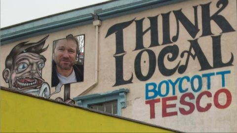
Originally, we intended to create a ‘home’ button on the scene containing the vox pop, which would then lead the user to the second home page. However, as I thought that it disturbed the idea of making maximum use of the visuals, I put an invisible button on the whole page instead.

The user can re-start the whole site by clicking on Vicki’s videos “Start Again” on the second home page (cf. fourth photo from above).

Last but not least, in general, the site is characterised by a rather “interfaceless” interface, as we abandoned the idea of visible buttons and a rather standard navigational menu bar.
Problem with the FLV playback component

In our Flash graffiti project, I was working with a placeholder for our ‘elite’ contra interview. When I replaced it today by embedding the FLV file in SWF to play in the timeline, I got this warning:
“Embedded video is likely to cause audio synchronization issues. This method of importing video is only recommended for short video clips with no audio track.”
And this is exactly what happened. So, I used the FLV playback component instead and the audio synchronization is absolutely fine, but the three-minute long ‘elite’ interview starts automatically now, as opposed to the plan to start on mouse-click only. The small videos that are moving around the elite interview, however, are only playing on mouse-click. Therefore, when the ‘elite’ interview finishes and I click on the button again, only the small videos are re-starting to play, however the ‘elite’ interview does not.
So, in order to solve this problem, I inserted a key frame into frame one that does contain the FLV playback component, but, in the properties section, I unticked the property “AutoPlay”. Then, in the second frame, I inserted the FLV playback component at the same spot as the first frame and made sure to tick the property “AutoPlay” this time, so that it would play once the user clicks on it.
Nevertheless, what I noticed with this solution is the fact that, once the user now clicks on the ‘elite’ interview, it completely disappears for an instant before it then re-appears and starts playing. I solved this problem by having a background that contains a screenshot of the ‘elite’ interview (before it starts) on top of the actual graffiti background (cf. photo below).
2

Background image

The original background of our project looks like this:

5

However, as I thought it looked too disturbing with the colourful videos, I thought it was important to have a less intense colour in it. As a consequence, I entirely desaturated the image and increased the contrast:

test_background

Then, when I tested it with Flash, the high contrast of the image was distracting too much from the videos on the site. Therefore, I decreased the contrast again. However, as it still appeared slightly gloomily, I added a tiny bit of colour, so that the page does not look sad and yet not distract from the videos:

template_final2


Flash layout problem

When I was working with Flash, I was using two containers, one for the pro-graffiti side and one for the con-graffiti side. However, the problem I encountered whilst working with these containers is that there are no frame sizes at all and that the rulers that I could possibly use as a solution differ from the normal ones of the stage and scenes. Therefore, I created different templates with screenshots (thus having the sizes of the stage, namely 1280 x 720) in Photoshop, which I then overlaid with the actual background image of the stage by previewing and re-arranging it accordingly.

template

1

Then, for the second home – the one where the vox pops are completely static – I created a replica of the first one by taking a screenshot of it, once the animations finish playing and all set at their places. That way, I could easily put copies of the ‘pro’ and ‘con’ containers that are lacking the animations onto the second home page.

con_animation_template

Changing the site’s function…

Vicki and I re-structured our website in the website today. Therefore, instead of having the home page all set, once the user opens the page, we wanted to make sure that he is definitely watching the piece-to-camera before interacting with anything else. In that sense, we would only have the piece-to-camera on the site and the two ‘elite’ interviews would appear on completion. Then, the user is asked to click on either the ‘elite’ interview in favour of or against graffiti, so that the smaller vox pops will appear.

2

As we have not filmed the piece-to-camera nor any of the ‘elite’ interviews yet, we used some of our vox pops footage for the creation of the test template in Adobe Flash. It was done by using ‘pro’ and ‘con’ containers, which would include each video depending on their point of view. These containers are programmed to appear on the stage, once the PTC finishes.

Below are the screenshots of how today’s test movie looks like:

  • Once the website is opened, only the PTC appears and plays:

layout2

  • ‘Elite’ interviews appear on completion:

layout3

  • Smaller vox pops appear once the user has clicked on an ‘elite’ interview:

layout4

Layout examples

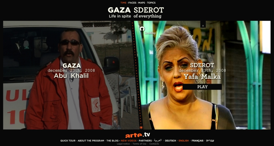
The new layout that we developed in the workshop on Friday was inspired by two interactive websites. The first one is the Gaza and Sderot example (cf. previous posts), as it presents contrasting views. What is also particularly interesting with regards to this website are the creative ways and with great attention to detail the video elements are incorporated into their site. I also particularly like the way the user is navigated through the site (namely, it is similar to the data journey project that we have done in the first semester).

photo4

Then, with regards to our home page, the website of Capturing Reality was particularly significant in terms of its structure. Namely, it arranges numerous images in an archive, thus relinquishing the rather ‘standard’ design of a normal menu bar.

On the website, it says about the project:

Capturing Reality: The Art of Documentary investigates a unique cinematic genre through encounters with some of its most influential practitioners. Over 30 luminaries (…) offer insight into their craft while reflecting on the nature of representation and the perennially contested status of the “truth”. More than 100 clips from landmark films enliven the discussion, offering a panoramic overview of contemporary documentary cinema.”

photo9